
28
Jun
Jun
Why follow and predict design trends?
Trends come and go, especially in the digital age. Outdated eyesores make for a poor user experience and, ultimately, a bad business reputation. But a lack of experimentation and imagination don’t go unnoticed either. Don’t get left behind.
Customers want to know you’re paying attention to the cutting-edge developments in graphic design, animation, and motion graphics so they can be confident in your ability to provide the best of the best.
Keeping up with design trends will better your brand in these ways:
- You broaden your skill set and pad your resume by tackling the latest in tech and design.
- You keep your brand contemporary to your customers and your marketplace, which gives you a leg up on your competition.
- You provide current and prospective clients with relevant content.
How do you stay trendy?
An artful understanding and use of modern design trends put you on the fast track to exposure. For stylish, clever designs that build buzz, here is what you need to do:
- Be aware of the content in front of you on a daily basis! Advertisements across billboards, magazines, and YouTube indicate trends making it into the mainstream.
- Network with like-minded professionals by attending several design- or marketing-based events each year.
- Use social media to follow or subscribe to designers, design firms, competitors, or design blogs that you admire and trust. Scroll to the bottom of this article for a list of need-to-know hashtags.
Predicted trends in graphic design for 2018:
This fantastic video by Philip VanDusen breaks down the “15 Trends in Graphic Design for 2018”:
We summarize his main points below. These are the smartest, stickiest trends to help you create the most beneficial designs for your clients in 2018.
Disjointed Text
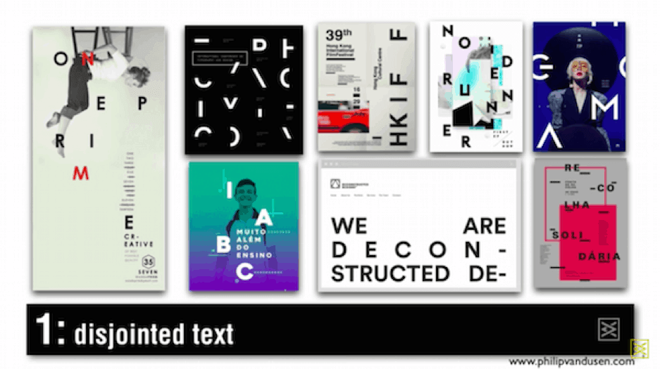
How to use disjointed text: Truncate letter forms to bring text into design.
Why: The abstract, erasure effect makes text illustrational. You get chaotic and unconventional lettering, but maintain readability.
Brightness
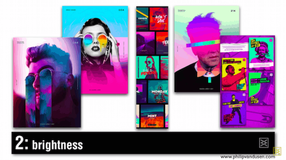
How to use brightness: Juxtapose garish neon colors. Think 80s.
Why: Make images pop with vibrant distinction.
Glitch
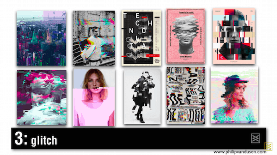
How to use glitch: Use waves and inverted colors to transform and break apart static imagery.
Why: Creates a corrupted, horror-movie digital interference.
Color Channel
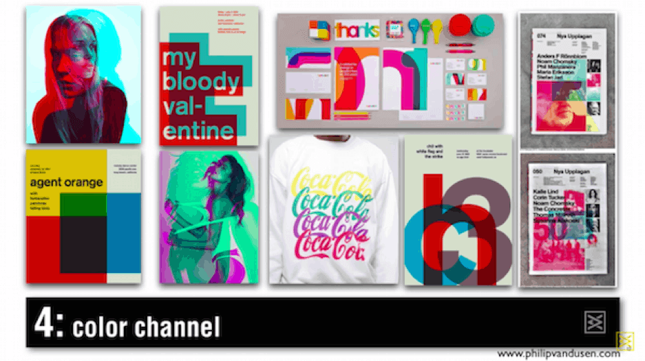
How to use color channel: Overlap and blend CMYK and RGB. The color transparency creates an illusion.
Why: The color shift is a striking distortion of reality. Think holographs and hallucinations.
Sliced Text

How to use sliced text: Slice whole words for a collage appearance.
Why: Creates visual interest when typography is the only design element.
Integration
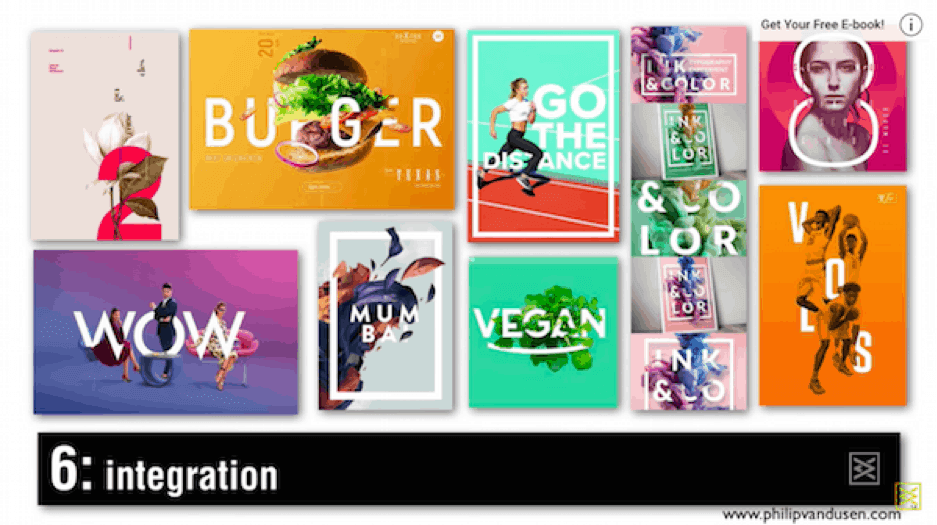
How to use integration: Closely integrate fonts or number forms with the objects in a photograph.
Why: Words interwoven with real-life objects as if they exist in same physical space.
Liquid

How to use the liquid effect: Layer visual highlights for a pooling, 3D effect.
Why: Provide dynamic texture to typography.
Font as Illustration
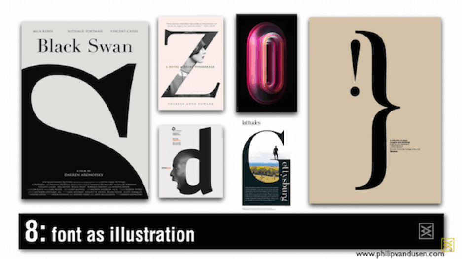
How to use font as illustration: Use the font or number form as an illustration.
Why: Text becomes a smart, inventive design element.
Iconification
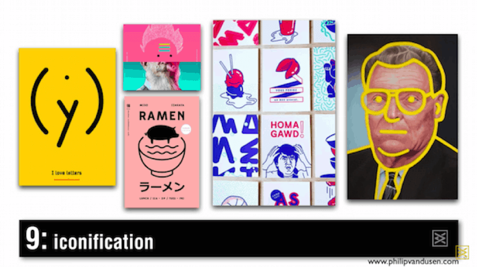
How to use iconification: Bring photography and illustrations down to their linear form to create icons.
Why: Simplify imagery to make it more impactful.
Playbill
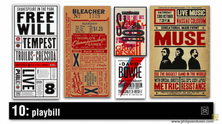
How to use the playbill effect: Layer text, shapes, and orientations.
Why: Invoke nostalgia of musical/fight posters from the 20s and 70s.
Text as Design
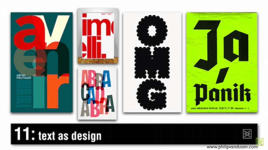
How to use text as design: Use unusual fonts, scale, overlaying, or cropping.
Why: Text forms become illustration to provide visual energy.
Systematic Color
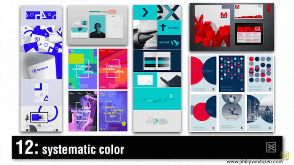
How to use systematic color: Apply a tight color palette and specific layout across a body of branded work.
Why: Cohesion.
Deconstructivism
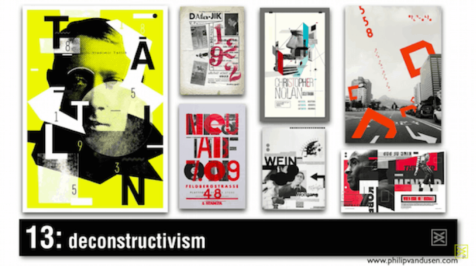
How to use deconstrucivism: Use monochromatic type designs and broken letter forms. Typically also intersperses black and white photography and bright colors.
Why: Choppy collage of arresting spatial elements.
Photo Masking
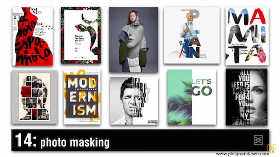
How to use photo masking: Use text elements, bars of color, and shapes to mask photography.
Why: Make transitions fluid and creative.
Transparency
![]()
How to use transparency: Use transparent colors as geometric shapes to overlay photographs.
Why: Stark juxtaposition.
Predicted trends in animation for 2018:
This fun video by Studio Binder showcases the emerging “Top 6 Motion Graphic Design Inspirations and Trends for 2018.”
Watch for examples from today’s trendsetters in animation:
Or read the full article: https://www.studiobinder.com/blog/motion-graphic-design-inspirations-trends/
We take a closer look at a few of the motion graphic trend examples below.
Retro
How to use retro: Use nostalgic colors and add grain or noise.
Why: Inspire a sentimental or comedic affection for your designs.
Seamless Transitions
How to use seamless transitions: Limit cuts between scenes.
Why: Uninterrupted flow that demands attention.
2D + 3D
How to combine 2D + 3D: Blend flat images and form styles to create depth and bolder angles. Layering is key.
Why: Give your designs volume to bring them to life
Kinetic Typography
How to use kinetic typography: Add movement to static words.
Why: Sensory storytelling that guides the audience and reinforces your message.
See how we keep on the cutting edge of animation trends.
When in doubt, keep it simple.
To prove your worth as a creative professional, you have to balance bold risks with tried and true methods. Follow the 4 basic principles of design:
- Use no more than 5 colors. (2-3 colors is best)
- Never use more than 3 fonts or stick to one font family.
- Establish a Visual Hierarchy. Use size and color to emphasize one item over another and draw the viewer’s eye.
- Embrace Whitespace. Having ample amounts within your design can add a greater sense of professionalism and sophistication. It also gives the viewer a moment of rest.
What can you do now?
Follow these hashtags:
#MotionGraphics
#Animation
#2DAnimation
#3DAnimation
#GraphicDesign
#Design
#Illustration
#AfterEffects
#Photoshop
#Illustrator
#Adobe
#Marketing
#Digital
#DigitalMarketing
Have graphic design predictions for 2018? Share them in the comments below.
Sources:
https://graphicmama.com/blog/graphic-design-trends-2018/
https://yesimadesigner.com/2018-graphic-design-trends-master/