
03
May
May
When walking into a sales presentation, your hands begin to sweat, and you feel the butterflies in your stomach. Even if you know you have a product or service that can meet the needs of your target audience, the challenge is getting them to understand that. Will they have objections you didn’t foresee? Will they understand the value?
Ever since the dawning of PowerPoint, pitch decks have been used in an attempt to deliver more impactful sales pitches. We all know the token presentations where a monotonous sales person reads every bullet point displayed on their slides. It’s only made worse by the cookie cutter templates, corny clip art graphics, overload of text, and painful transitions (fade to black). This format is outdated and doesn’t pack the punch needed to engage a client and pique their curiosity, let alone close a deal.
An effective pitch deck should illustrate the concepts being presented in an imaginative way. It should do more than just state the facts, but tell an engaging story that the client is invited to become a part of. How can you achieve this and what does it look like?
How to design a winning pitch deck
Integrate high-quality visuals
Did you know that 90% of the information transmitted to the human brain every day is visual and 65% of people are visual learners? The preference of visuals can be seen in the fact that content with graphics and text is shared 94% more than content with text alone.
Further stats show that people retain 80% of what they see, 20% of what they read, and 10% of what they hear. So if your pitch is all vocal with no visual component, very little of what you say will be remembered. By including a pitch deck of text, the odds are better but still don’t compete with the retainment level of visual presentations. Knowing this, it is important to create custom high-quality visuals that represent and illustrate the messages you want to share.
Here is an example.
 The stat in this slide could have been presented as a bullet point with a clip art graphic of an old television. However, the image used transports you back to the 1970’s and gets your mind thinking about that period. You may wonder what television was like back then and how much it has changed in such a short time. The next slide reinforces that train of thought.
 Here you get another stat about the number of ads watched per day in the 70’s along with a look at how a typical living room looked. This further engages the imagination.
These are perfect examples of high-quality custom visuals that can help engage your potential clients while increasing the percentage of your presentation that they remember. Get creative and show your message in addition to telling it.
Here you get another stat about the number of ads watched per day in the 70’s along with a look at how a typical living room looked. This further engages the imagination.
These are perfect examples of high-quality custom visuals that can help engage your potential clients while increasing the percentage of your presentation that they remember. Get creative and show your message in addition to telling it.
 The designer creatively used a play on Game of Thrones with the title ‘Game of Phones’, which continues to tell the story of an epic battle between poor phone etiquette and decency in the workplace. This narrative integrated with the issue helps to engage the imagination and keep the audience interested.
By delivering linear content with a clear narrative in your pitch deck, you can engage your potential client and make a lasting impression.
The designer creatively used a play on Game of Thrones with the title ‘Game of Phones’, which continues to tell the story of an epic battle between poor phone etiquette and decency in the workplace. This narrative integrated with the issue helps to engage the imagination and keep the audience interested.
By delivering linear content with a clear narrative in your pitch deck, you can engage your potential client and make a lasting impression.
 But does color make that much of a difference? One study called the “Impact of color on marketing” reported that 90% of the snap judgments made about products are based on solely color. Another study called “Exciting red and competent blue” found colors significantly impact purchasing intent because they impact how a brand is perceived.
When walking into a sales presentation, you can help your client perceive your brand in the way you want by using certain colors in your pitch deck. Here are a few slides which demonstrate how the chosen red, gray, and black color palette stays consistent throughout the pitch deck.
Be sure to identify what personality you want your brand to convey, what colors are associated with those traits, and which colors compliment each other best. Then, you can narrow down the final colors and use them consistently through your deck.
In this slide, an icon is used to help communicate and reinforce the meaning of each investment highlight.
Notice the newsletter icon to reinforce the content of the page.
Look for opportunities to integrate icons which help drive home ideas.
Select purposeful typography
A good designer will also choose creative and impactful typography for their presentations. Don’t be afraid to mix and match fonts and to use text hierarchies to prioritize information. However, be sure to choose typography that matches your brand, and that is easy to read.
Even if a font looks cool, it isn’t effective if potential clients can’t read the words. Furthermore, fonts can communicate messages by their styles and an improper match can cause dissonance. For example, comic sans may be too playful a font for a serious company, like an investment firm, trying to earn trust.
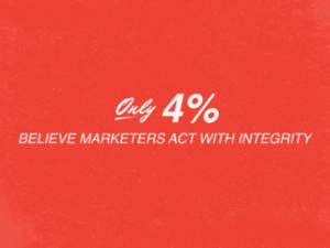
Here is an example of an effective font choice.
In this slide, the 4% is the key piece of information being presented. It is large and bold. Next, the tagline demands attention through the designer’s use of all caps. “Only’ is the least demanding on the page but is a helpful addition to making the point.
The font is an active element of pitch decks which can be used strategically.
The second is very heavy on the text side and makes the reader tune out from an information overload.
But does color make that much of a difference? One study called the “Impact of color on marketing” reported that 90% of the snap judgments made about products are based on solely color. Another study called “Exciting red and competent blue” found colors significantly impact purchasing intent because they impact how a brand is perceived.
When walking into a sales presentation, you can help your client perceive your brand in the way you want by using certain colors in your pitch deck. Here are a few slides which demonstrate how the chosen red, gray, and black color palette stays consistent throughout the pitch deck.
Be sure to identify what personality you want your brand to convey, what colors are associated with those traits, and which colors compliment each other best. Then, you can narrow down the final colors and use them consistently through your deck.
In this slide, an icon is used to help communicate and reinforce the meaning of each investment highlight.
Notice the newsletter icon to reinforce the content of the page.
Look for opportunities to integrate icons which help drive home ideas.
Select purposeful typography
A good designer will also choose creative and impactful typography for their presentations. Don’t be afraid to mix and match fonts and to use text hierarchies to prioritize information. However, be sure to choose typography that matches your brand, and that is easy to read.
Even if a font looks cool, it isn’t effective if potential clients can’t read the words. Furthermore, fonts can communicate messages by their styles and an improper match can cause dissonance. For example, comic sans may be too playful a font for a serious company, like an investment firm, trying to earn trust.
Here is an example of an effective font choice.
In this slide, the 4% is the key piece of information being presented. It is large and bold. Next, the tagline demands attention through the designer’s use of all caps. “Only’ is the least demanding on the page but is a helpful addition to making the point.
The font is an active element of pitch decks which can be used strategically.
The second is very heavy on the text side and makes the reader tune out from an information overload.
 Ensure to create a balance, so your slides are enjoyable to look at, easy to understand, and balanced.
 The stat in this slide could have been presented as a bullet point with a clip art graphic of an old television. However, the image used transports you back to the 1970’s and gets your mind thinking about that period. You may wonder what television was like back then and how much it has changed in such a short time. The next slide reinforces that train of thought.
 Here you get another stat about the number of ads watched per day in the 70’s along with a look at how a typical living room looked. This further engages the imagination.
These are perfect examples of high-quality custom visuals that can help engage your potential clients while increasing the percentage of your presentation that they remember. Get creative and show your message in addition to telling it.
Here you get another stat about the number of ads watched per day in the 70’s along with a look at how a typical living room looked. This further engages the imagination.
These are perfect examples of high-quality custom visuals that can help engage your potential clients while increasing the percentage of your presentation that they remember. Get creative and show your message in addition to telling it.
Become a storyteller
Remember, it’s not just the minds of your audience that you need to appeal to, it’s also the hearts. You need to create something that is highly impactful and compelling, so they will be moved to take action. How do you do that in your pitch deck? Insert storytelling here. Did you know that, according to a marketing post published on Forbes, 92% of consumers want brands to make ads that feel like stories? Storytelling affects the brain in an interesting way. You can probably remember sitting wide-eyed as a child when your parent told you stories. While we might contain ourselves more as adults, the impact stories have on our brains is the same. According to research reported by Fast Company, when a story is being told, a part of the brain is activated in the person hearing the story which allows them to turn it into their idea and experience. This process is called neural coupling. The listener and storyteller will experience similar brain activity while the story is being told. Talk about getting on the same page with a client! Many areas of the brain are at work in this process including the Broca’s and Wernicke’s area as well as the motor cortex, sensory cortex, and frontal cortex. Interestingly, when simply processing facts, only two areas of the brain are activated which are the Broca’s and Wernicke’s. The experience that occurs with storytelling is much more interactive on a biological level than when just sharing facts and figures. In addition, dopamine releases in the brain when a story has an emotional charge. This makes it easier for people to remember information and helps them remember it with more accuracy. See, for example, how this pitch deck uses storytelling combined with pop culture to deliver the message. The designer creatively used a play on Game of Thrones with the title ‘Game of Phones’, which continues to tell the story of an epic battle between poor phone etiquette and decency in the workplace. This narrative integrated with the issue helps to engage the imagination and keep the audience interested.
By delivering linear content with a clear narrative in your pitch deck, you can engage your potential client and make a lasting impression.
The designer creatively used a play on Game of Thrones with the title ‘Game of Phones’, which continues to tell the story of an epic battle between poor phone etiquette and decency in the workplace. This narrative integrated with the issue helps to engage the imagination and keep the audience interested.
By delivering linear content with a clear narrative in your pitch deck, you can engage your potential client and make a lasting impression.
Choose an applicable color palette
Next up is color. Color is a powerful element in a presentation so the color palette in your pitch deck should be chosen carefully. Where do you start? With your brand. What impression are you trying to make? This infographic helps to demonstrate the connection between color, existing brands, and emotions. But does color make that much of a difference? One study called the “Impact of color on marketing” reported that 90% of the snap judgments made about products are based on solely color. Another study called “Exciting red and competent blue” found colors significantly impact purchasing intent because they impact how a brand is perceived.
When walking into a sales presentation, you can help your client perceive your brand in the way you want by using certain colors in your pitch deck. Here are a few slides which demonstrate how the chosen red, gray, and black color palette stays consistent throughout the pitch deck.
But does color make that much of a difference? One study called the “Impact of color on marketing” reported that 90% of the snap judgments made about products are based on solely color. Another study called “Exciting red and competent blue” found colors significantly impact purchasing intent because they impact how a brand is perceived.
When walking into a sales presentation, you can help your client perceive your brand in the way you want by using certain colors in your pitch deck. Here are a few slides which demonstrate how the chosen red, gray, and black color palette stays consistent throughout the pitch deck.


 Be sure to identify what personality you want your brand to convey, what colors are associated with those traits, and which colors compliment each other best. Then, you can narrow down the final colors and use them consistently through your deck.
Integrate iconography
An icon is a symbol which can help to simplify complex ideas, reduce confusion, and speed up the transmission of information. All of which are good things in a sales presentation. It works by reducing the mental effort required to receive the information by bypassing the phonological loop (which is a phonetic rehearsal system used to process speech). The catch is that your icons have to be relevant so that the audience doesn’t get confused. It’s also good practice to be sensitive to the fact that some icons can be offensive so should be avoided (i.e. religious, political), and that all icons should be graphically and contextually consistent. Here are a few examples of icons used effectively. In this slide, an icon is used to help communicate and reinforce the meaning of each investment highlight.
 Notice the newsletter icon to reinforce the content of the page.
Look for opportunities to integrate icons which help drive home ideas.
Select purposeful typography
A good designer will also choose creative and impactful typography for their presentations. Don’t be afraid to mix and match fonts and to use text hierarchies to prioritize information. However, be sure to choose typography that matches your brand, and that is easy to read.
Even if a font looks cool, it isn’t effective if potential clients can’t read the words. Furthermore, fonts can communicate messages by their styles and an improper match can cause dissonance. For example, comic sans may be too playful a font for a serious company, like an investment firm, trying to earn trust.
Here is an example of an effective font choice.
Notice the newsletter icon to reinforce the content of the page.
Look for opportunities to integrate icons which help drive home ideas.
Select purposeful typography
A good designer will also choose creative and impactful typography for their presentations. Don’t be afraid to mix and match fonts and to use text hierarchies to prioritize information. However, be sure to choose typography that matches your brand, and that is easy to read.
Even if a font looks cool, it isn’t effective if potential clients can’t read the words. Furthermore, fonts can communicate messages by their styles and an improper match can cause dissonance. For example, comic sans may be too playful a font for a serious company, like an investment firm, trying to earn trust.
Here is an example of an effective font choice.
 In this slide, the 4% is the key piece of information being presented. It is large and bold. Next, the tagline demands attention through the designer’s use of all caps. “Only’ is the least demanding on the page but is a helpful addition to making the point.
The font is an active element of pitch decks which can be used strategically.
In this slide, the 4% is the key piece of information being presented. It is large and bold. Next, the tagline demands attention through the designer’s use of all caps. “Only’ is the least demanding on the page but is a helpful addition to making the point.
The font is an active element of pitch decks which can be used strategically.
Use proper spacing
White space is the empty area between design elements and within individual design elements. It doesn’t necessarily need to be white (despite the name), just empty. While you may think white space is equal to wasted space, on the contrary, it does serve a purpose. White space allows you to direct attention to the elements which are most important without distraction or clutter. It creates a balance and improves the visual communication experience. Take a look at these two slides. This first one maintains the balance of empty space and design elements well. The second is very heavy on the text side and makes the reader tune out from an information overload.
 Ensure to create a balance, so your slides are enjoyable to look at, easy to understand, and balanced.