When it comes to presentations, it seems that there are two types: The ones that are so dry they bore you to sleep, and the ones that are so full of images and words that you get a headache just by looking at them. I’ve attached two videos below that I think you will relate to when it comes to feelings about presentations.
https://m.youtube.com/watch?v=nGA-GCq7JWM
I think most would agree that watching more than 30 seconds of the first is painful—not to mention your attention is lost within 10 seconds. But every meeting, lecture, event, and conference you attend is run off of presentations. That’s the primary way information is shared to big groups or committees.
So why are they all so awful? Is it because we see them as a means to an end? Or is it that no one has time to put a good one together? Rick Enrico, CEO of SlideGenius, Inc., wrote an article for LinkedIn explaining why PowerPoints are still relevant. Rick lists three main reasons they are effective:
 Avalaunch’s Slide
 We cleaned up this slide by removing a lot of the text. We also made it eye-catching by making the product itself the main focal point. This makes for a more appealing and easily digestible slide. It also better highlights the product’s features.
 Avalaunch’s Slide
 We made the slide visually appealing by removing a lot of the text and adding a high-quality company photo to the background. Although the photo is just used in the background, it helps draw the eye to the slide. The short, concise facts on the side of the slide allow readers to quickly grasp the point.
Because the client logos were such a big part of the first slide, they were also incorporated in the new slide. This time the clients subtly border the top and bottom of the slide, which doesn’t take away from any of the important information readers need to grasp the main point.
We made the slide visually appealing by removing a lot of the text and adding a high-quality company photo to the background. Although the photo is just used in the background, it helps draw the eye to the slide. The short, concise facts on the side of the slide allow readers to quickly grasp the point.
Because the client logos were such a big part of the first slide, they were also incorporated in the new slide. This time the clients subtly border the top and bottom of the slide, which doesn’t take away from any of the important information readers need to grasp the main point.
 Avalaunch’s Slide
 While we didn’t add a ton of visuals, we did add engaging graphics that correlate with the information and cleanly break up ideas. Lastly, the information was organized into a clear hierarchy. Believe it or not, the brain likes order.
Now that you know the merits of a great PowerPoint, it’s your turn to go out and create one.
While we didn’t add a ton of visuals, we did add engaging graphics that correlate with the information and cleanly break up ideas. Lastly, the information was organized into a clear hierarchy. Believe it or not, the brain likes order.
Now that you know the merits of a great PowerPoint, it’s your turn to go out and create one.
- They engage audiences’ minds. I think we all have been in a meeting where the head-bobbing of sleepy people is a common theme. If you don’t engage with your audience, you won’t have one by the end.
- They can persuade your audience.
- They can give you control over the conversation.
- Clean up the slides and give everything some room to breathe so it’s easier to read.
- Use clear and effective hierarchy.
- Use color to your advantage.
- Cut content down.
- Add visuals where you can even if it’s just in the background.
- First up we have a slide that shows the features of a specific product. The original is text-heavy and doesn’t show the product as well as it could.
 Avalaunch’s Slide
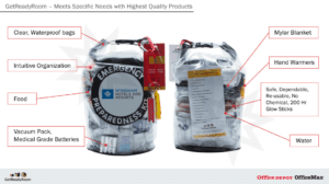 We cleaned up this slide by removing a lot of the text. We also made it eye-catching by making the product itself the main focal point. This makes for a more appealing and easily digestible slide. It also better highlights the product’s features.
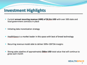
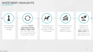
- Next, we have an “About” slide. The original focus largely on the company’s clients. There is a lot of text in this slide, which drowns out any pertinent information.
 Avalaunch’s Slide
 We made the slide visually appealing by removing a lot of the text and adding a high-quality company photo to the background. Although the photo is just used in the background, it helps draw the eye to the slide. The short, concise facts on the side of the slide allow readers to quickly grasp the point.
Because the client logos were such a big part of the first slide, they were also incorporated in the new slide. This time the clients subtly border the top and bottom of the slide, which doesn’t take away from any of the important information readers need to grasp the main point.
We made the slide visually appealing by removing a lot of the text and adding a high-quality company photo to the background. Although the photo is just used in the background, it helps draw the eye to the slide. The short, concise facts on the side of the slide allow readers to quickly grasp the point.
Because the client logos were such a big part of the first slide, they were also incorporated in the new slide. This time the clients subtly border the top and bottom of the slide, which doesn’t take away from any of the important information readers need to grasp the main point.
- Lastly, we have a highlight slide. This slide is nothing but text, with no visuals at all. The information is valuable, but the way it’s presented is boring—and a boring slide leads to little to no engagement.
 Avalaunch’s Slide
 While we didn’t add a ton of visuals, we did add engaging graphics that correlate with the information and cleanly break up ideas. Lastly, the information was organized into a clear hierarchy. Believe it or not, the brain likes order.
Now that you know the merits of a great PowerPoint, it’s your turn to go out and create one.
While we didn’t add a ton of visuals, we did add engaging graphics that correlate with the information and cleanly break up ideas. Lastly, the information was organized into a clear hierarchy. Believe it or not, the brain likes order.
Now that you know the merits of a great PowerPoint, it’s your turn to go out and create one.